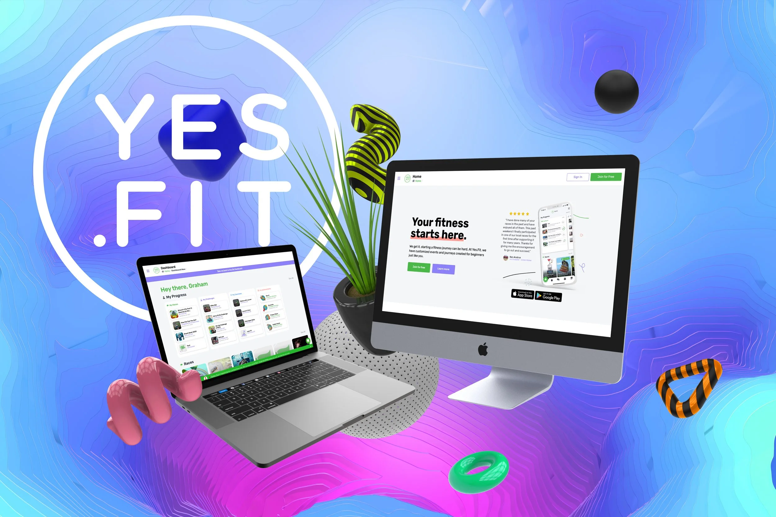
A full website rebuild on a modern stack, designed mobile first for an audience that turned out to live on their phones.
RoleLead Designer
ScopeResearch, UX, UI, Handoff
StackReact · Next.js · Tailwind
Year2021
Context
Bring the website up to the app.
Right after the mobile redesign shipped, the website was still on the old look and still sharing a codebase with the legacy React Native app. It no longer matched the product, the calls to action were weak, and the logged-in dashboard was cluttered enough that people struggled to see how they were actually doing.
As lead designer I owned the rebuild end to end: research, UX, UI, and handoff. We stood up a fresh repository and rebuilt on React, Next.js, and Tailwind so we had the performance and the component model to move fast without losing consistency.
90%Of users were on mobile
↑VIP membership growth month over month
2Highest-traffic surfaces rebuilt first
01 · Listen
Watch the real sessions before redrawing anything.
I instrumented the soon-to-be-legacy site with Heap for product analytics and Hotjar for session replay, and ran Maze for usability testing. Hours of real recordings surfaced the mis-clicks, confusions, and dead ends people hit most, and surveys of the Yes.Fit community told us which new features actually mattered.
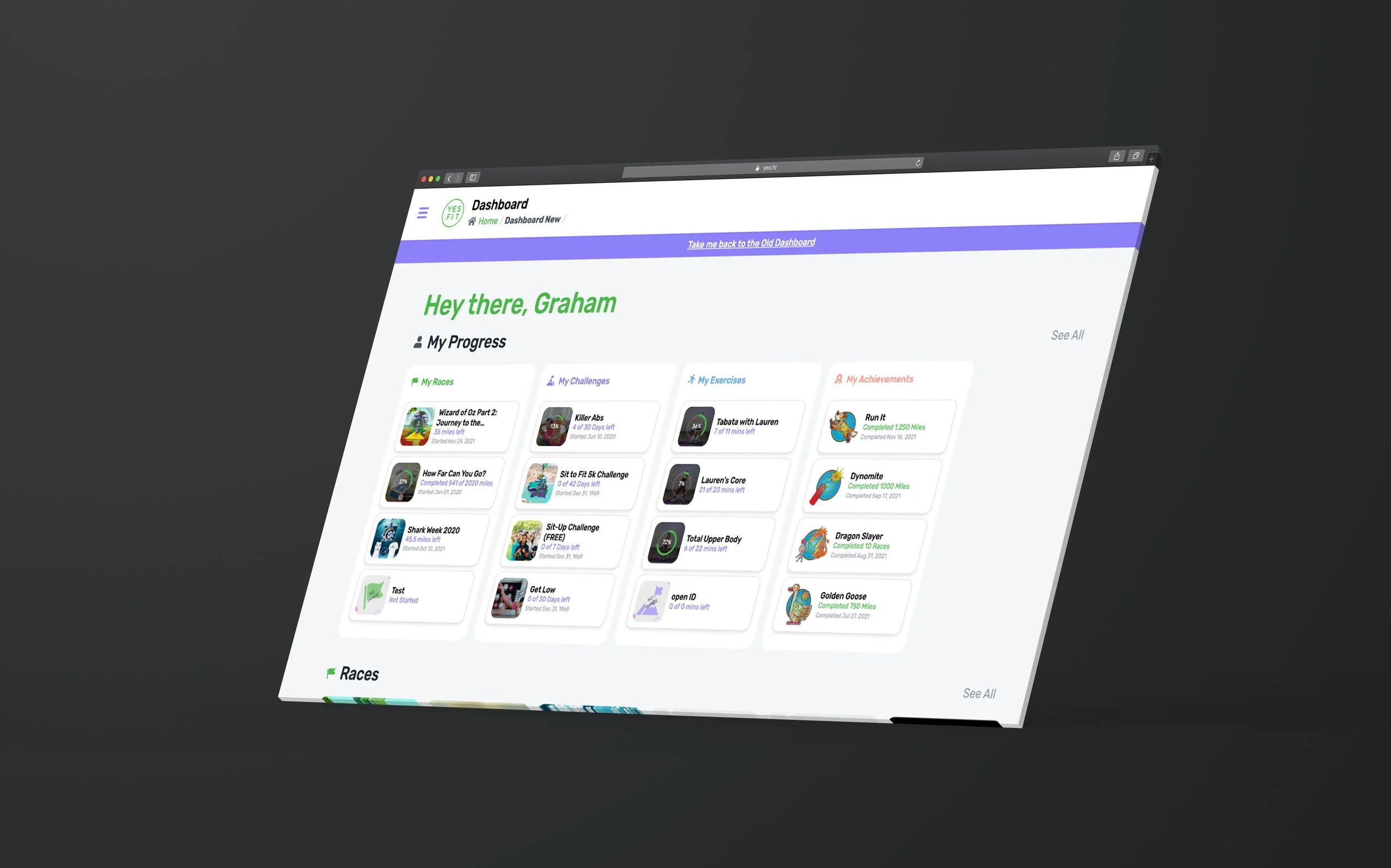
Two things were clear early: the homepage did not explain what Yes.Fit was fast enough, and the dashboard buried the one thing members wanted, a clear snapshot of their progress. So we started where the traffic was, the logged-out homepage and the member dashboard.
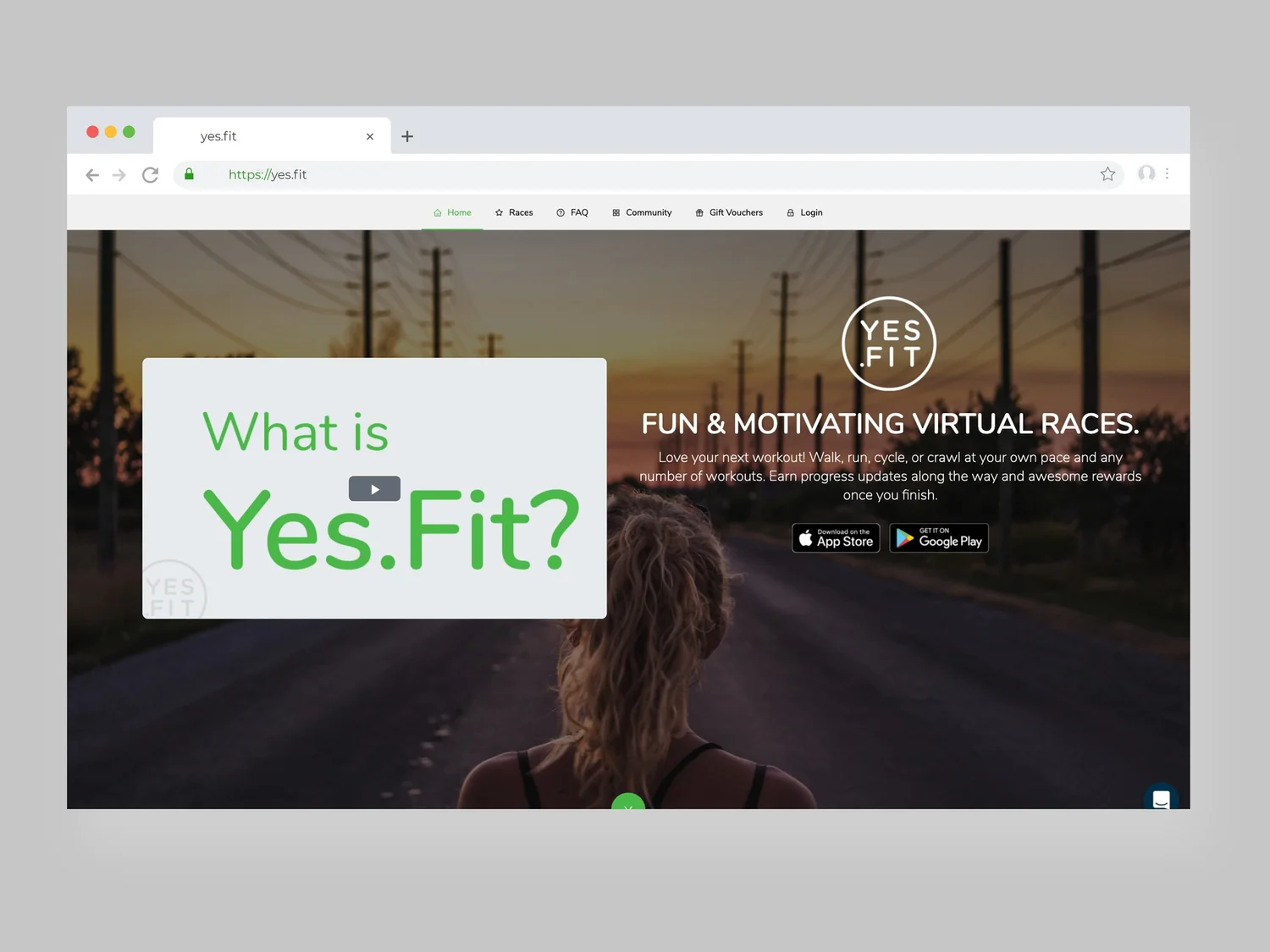
Before: the legacy homepage, out of step with the new app.After: a clearer pitch, stronger calls to action, cohesive with the app.
02 · Structure
Wireframe the shell, then map every state.
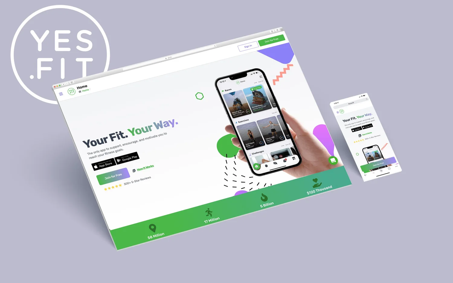
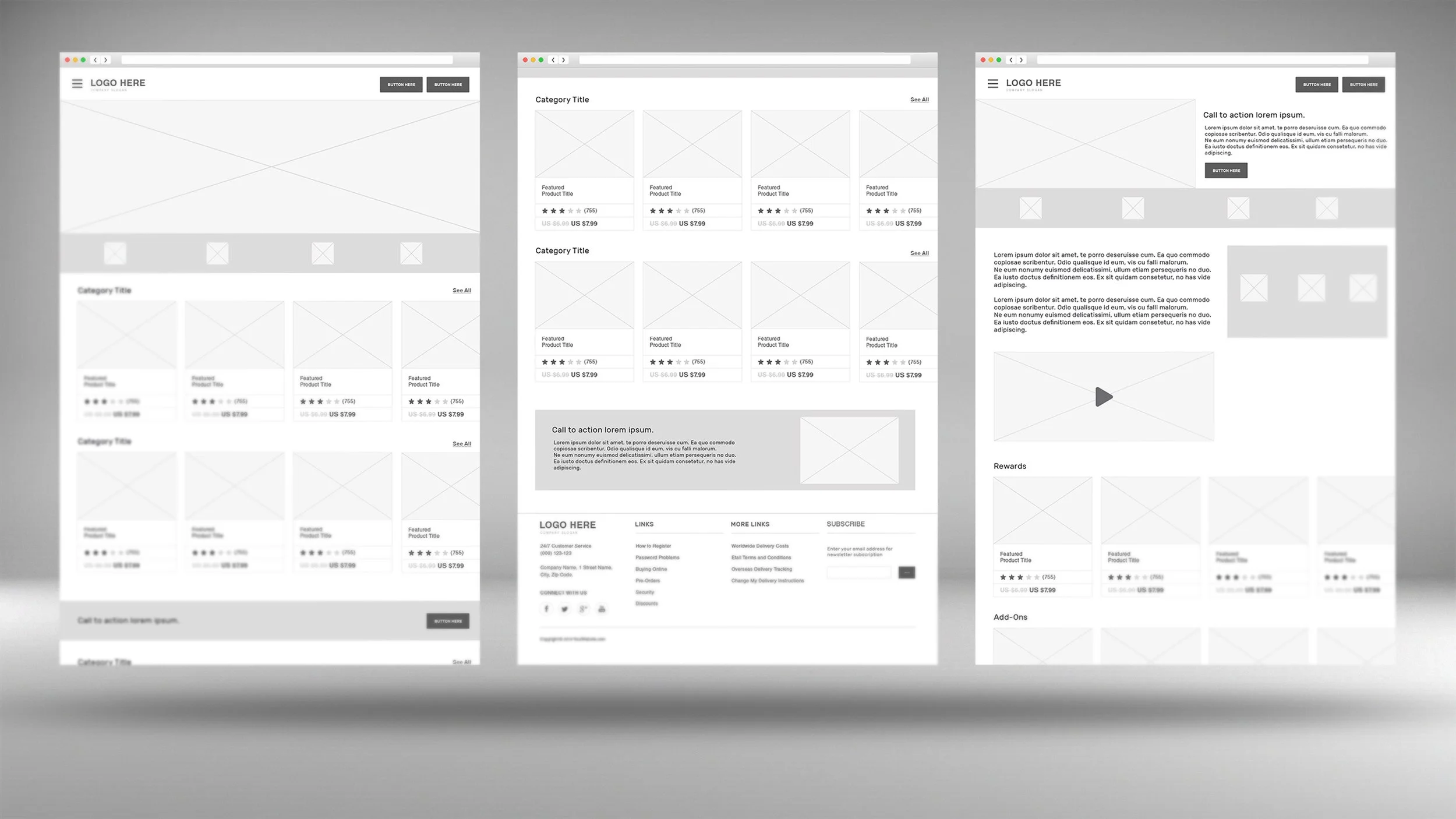
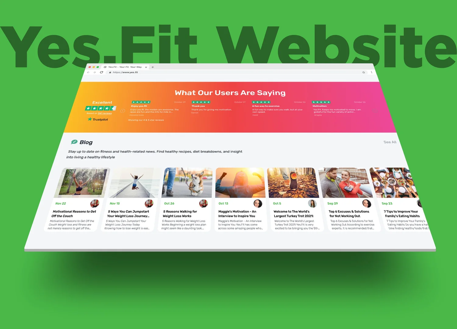
Most of the site works as a marketing engine that drives people to the app, so I wireframed landing layouts built to convert: attention-grabbing copy, strong imagery, and responsive blocks we could recombine quickly. Tailwind gave us exactly the system we needed to assemble pages fast and keep them consistent.
With Exercises and Challenges joining the catalog, I rebuilt the sitemap and added a dedicated "My Stuff" section to the main navigation, so logged-in members could jump straight to the content that was theirs. A point of repeated feedback, solved with one structural move.
Wireframes for the new marketing layouts and conversion blocks.
We assumed desktop mattered for our older demographic. The data said 90% of them were on mobile, so mobile first stopped being a preference and became the brief.
03 · States
A journey map the engineers could build from.
The logic got complicated fast. What a person saw depended on whether they were logged in and whether they were a VIP member, so I built a detailed journey map that spelled out the components, pages, and data for each state. That map became the shared reference for engineering and removed most of the guesswork from handoff.
From there I focused on making the move between app and web feel like one product. Same patterns, same language, same visual system, so a member never felt like they had crossed a seam.
The rebuilt dashboard: a clear, scannable snapshot of progress.
Results
Clearer pricing, more members.
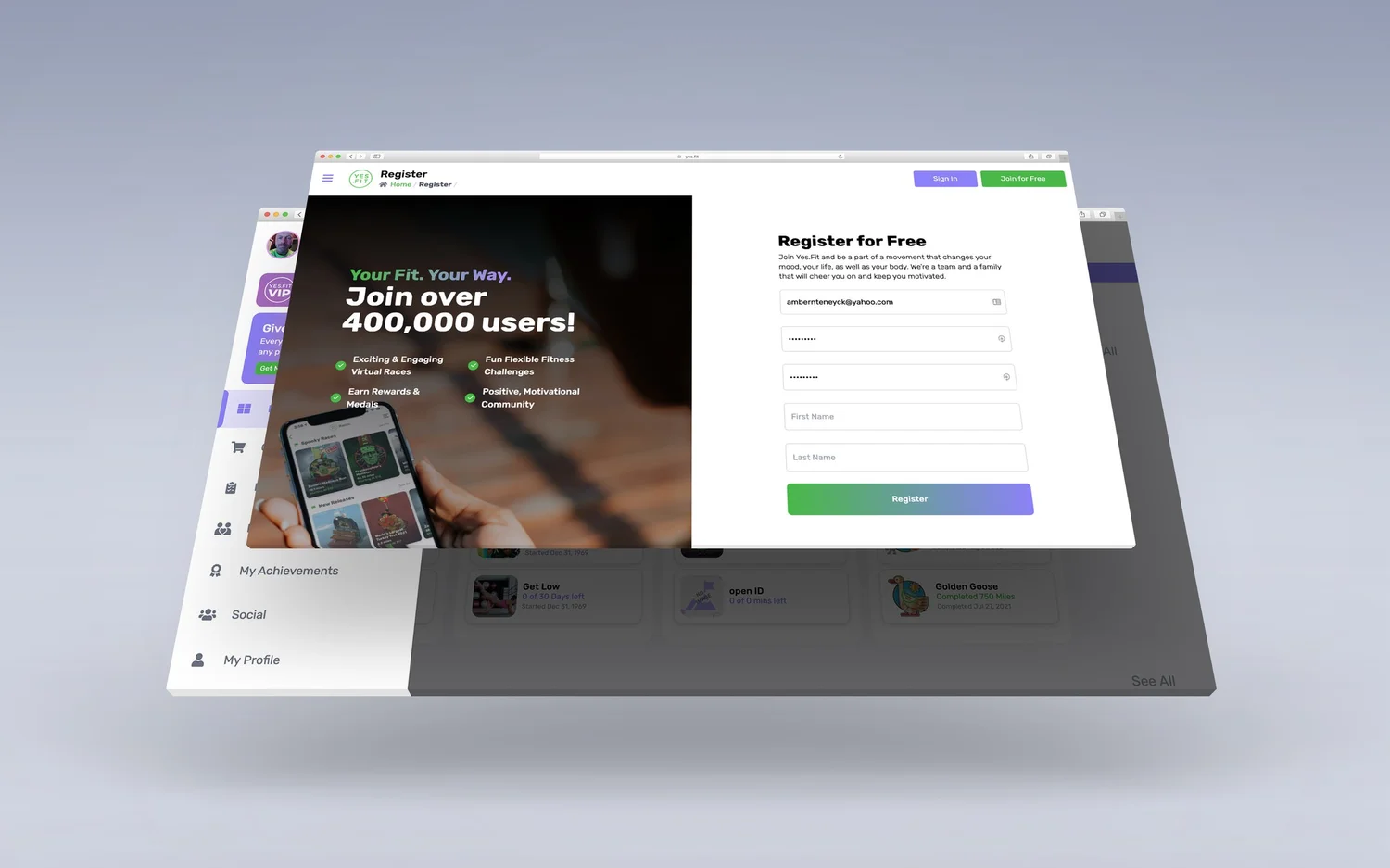
The business runs on subscriptions, so the membership purchase screen got a focused redesign. Working with the CPO, we moved to clear monthly, quarterly, and yearly tiers, with a real discount for paying up front. It read better, it converted better, and VIP memberships climbed month over month after launch.
Paired with a stronger homepage pitch and a mobile-first build, the site finally matched the product it was selling, and gave both new and returning members an easier path to the parts that mattered.