A social reading app where readers connect, find conversations worth having, and feel at home before their network even grows.
RoleLead Product Designer
ScopeUX, UI, Research, Brand, System
PlatformiOS & Web
Year2025
Context
More than a reading tracker.
Threadable set out to be a social space where readers share insight, discover books, and connect with a community that gets them. The product worked, but the value was not landing. New users were not finding a reason to stay, engagement was inconsistent, and the brand looked different in every place a reader encountered it.
I joined as Lead Product Designer, owning UX and UI, user research, and a design system that had to serve both the product and the brand. The goal was simple to say and hard to do: help a new reader feel the point of Threadable in the first few minutes, then keep them.
01 · Discover
Where the product was losing people.
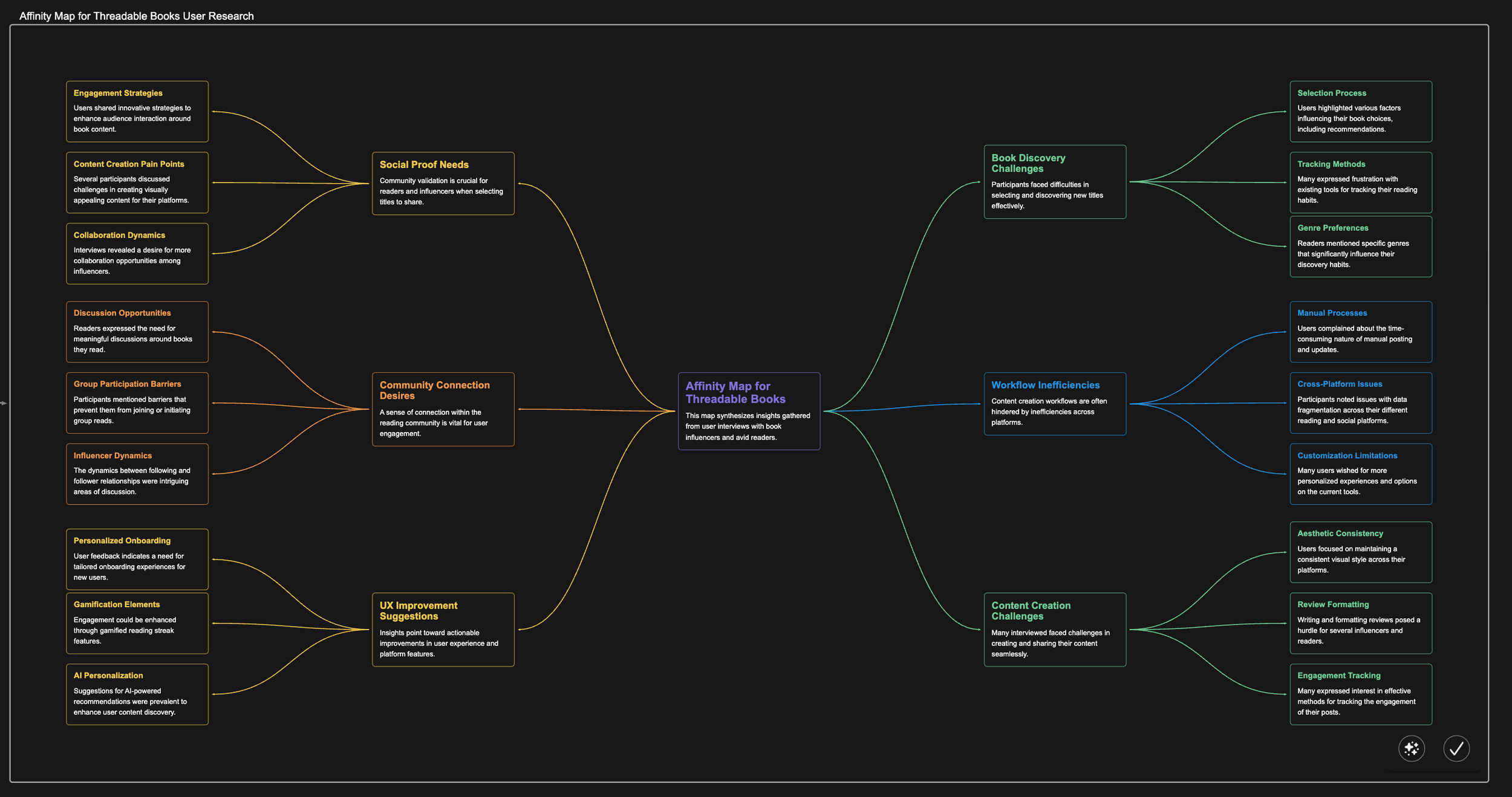
I ran a UX audit, mapped the existing flows, and interviewed readers, influencers, and casual users to understand what actually motivated them. I paired that with usage data to find exactly where people dropped off after signup.
Onboarding was front-loaded. Too many steps stood between signup and any real value.
The cold start problem. With few connections, the social product felt empty, so new readers left before it could fill in.
Inconsistent brand. Mismatched visuals across app and marketing eroded trust and made navigation confusing.
People wanted conversation, not scores. The demand was for genuine discussion, not another star rating.
Three readers to design for
I synthesized 15+ interviews into three archetypes that guided every prioritization call after.
The Curator loves visual storytelling: aesthetics, quotes, shelves worth sharing.
The Critic wants depth: detailed reviews and nuanced discussion.
The Community Builder thrives on interaction and brings other people along.
02 · Define
One question to design against.
How might we help new readers feel the value of Threadable quickly, inside a cohesive system that can scale as the product grows?
That framed three goals: cut friction in onboarding, surface community early so the product never feels empty, and unify the brand and UI into one system the team could build on.
A system, not a set of screens
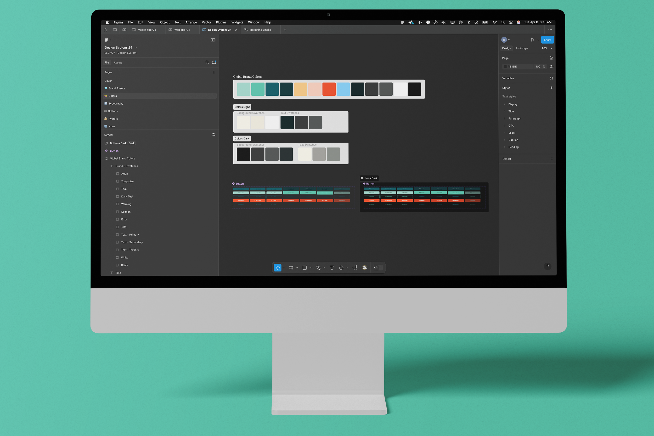
I built a modular design system in Figma: tokens, components, and usage guidelines, plus a brand identity covering logo, color, type, and voice. Every component shipped with rationale, so the team could execute consistently as it grew. I treated the system as documentation, not decoration.
Design system: tokens, components, and documented usage built for handoff and scale.
Most reading apps need a crowd to feel social. I designed ambient social proof so the product felt alive on day one, even with five connections.
03 · Develop
Solving the empty room.
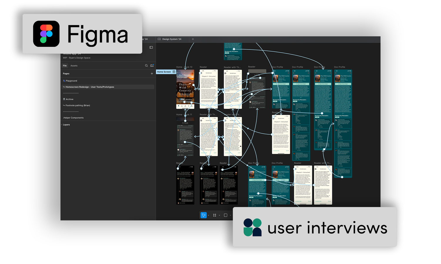
The core challenge was creating social value before network density. I tested wireframes and prototypes with readers and iterated on what the data showed.
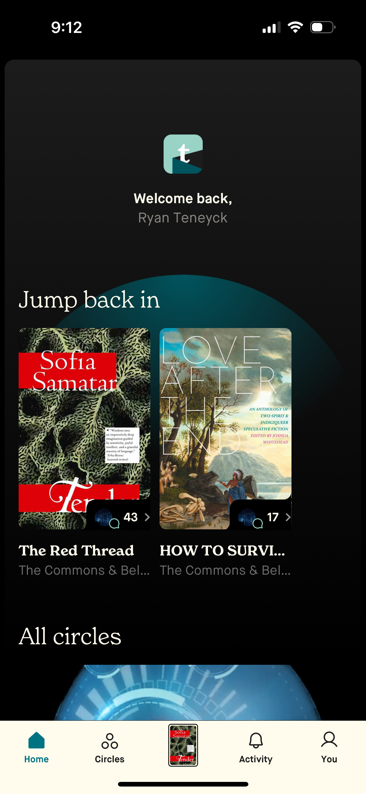
Onboarding dropped from many steps to three, focused on interest selection and immediate content.
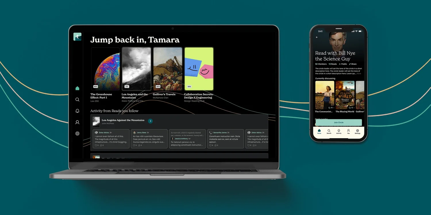
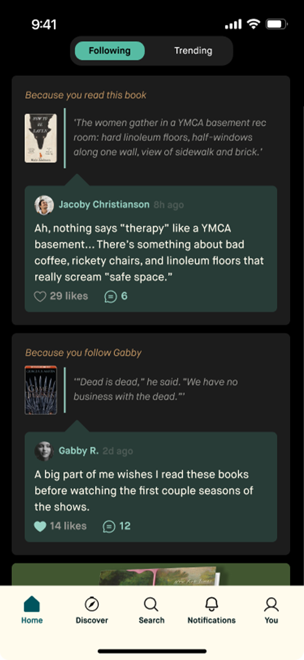
Feeds blended curated community activity with friend activity, so a new reader saw a living conversation instead of a blank slate.
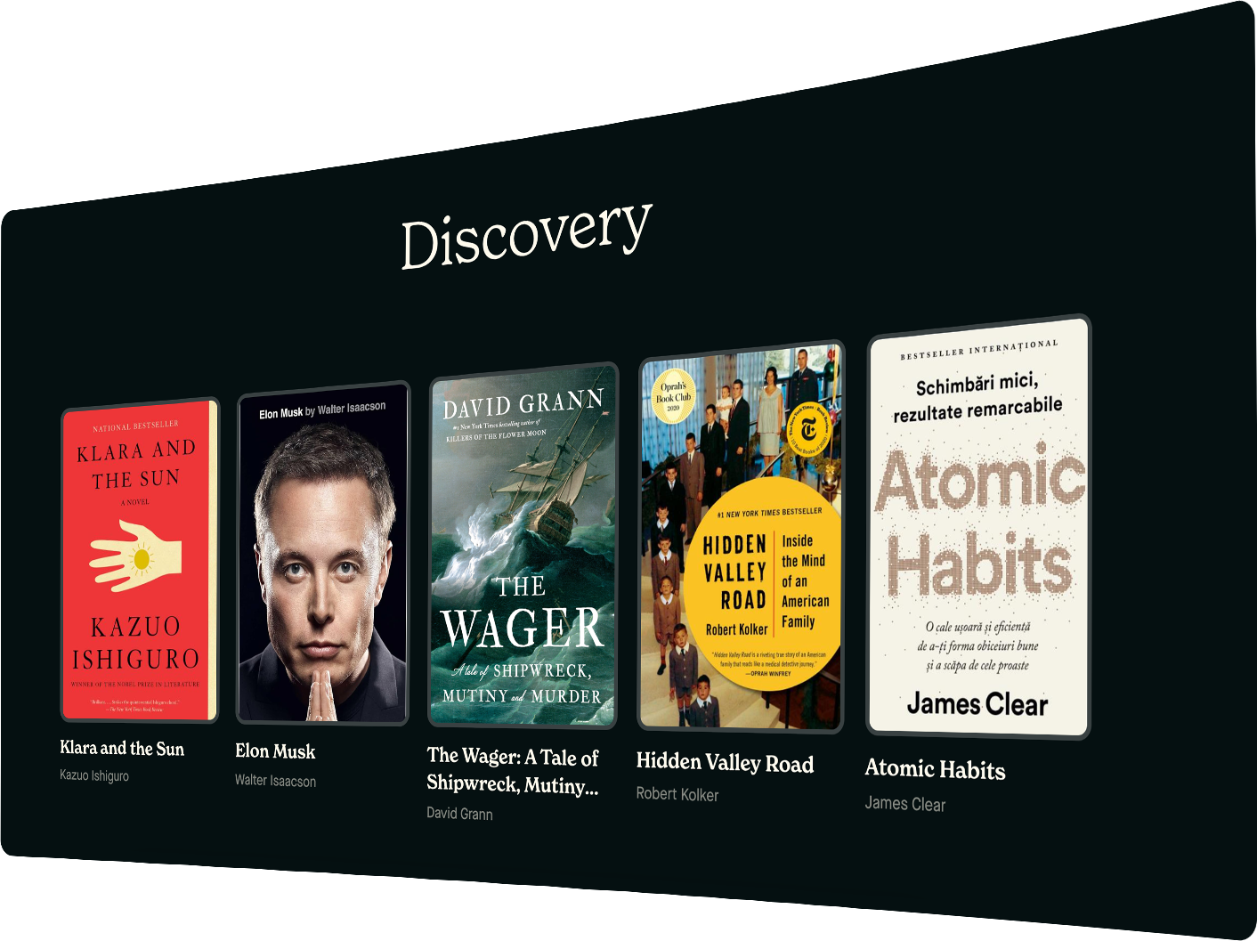
Algorithmic curation surfaced relevant discussions and readers by book preference, not just the social graph.
Iterations from testing: simplified optional profile fields, added feed filters so people could ease in, and tuned color and type for legibility.
Readers with fewer than five connections still showed 34% higher retention when exposed to community content. The point was to deliver social value immediately, not only at scale.
Clickable prototypes for live testing.Discovery surfaces community signal early.
04 · Deliver
What shipped, and what it moved.
The relaunch combined a streamlined onboarding flow that shows relevant content right away, a hybrid social feed with ambient social proof, and a scalable design system with consistent type, color, and components. We measured everything through feature-flagged releases and cohort analysis, tracking micro-conversions like first book add, profile completion, and first social interaction.
+60%Active users in six months
+40%Overall engagement
+25%User retention
+67%Rating completion, new scoring UI
2×Comment engagement
+34%Retention, low-connection users
Before and after
BeforeAfter
Reflection
What I would carry forward.
This project reinforced two things. Social experiences have to be validated with users who do not yet have a network, because that is the moment most products lose them. And a design system pays off fastest when it goes in early, before inconsistency becomes debt. It also kept me honest about balancing stakeholder requests against what testing actually showed.