Turning a contractor-built loyalty app into a product pet parents love, and a growth engine the business could count on.
RoleDesign Lead, team of four
ScopeProduct, System, Process
PlatformiOS & Android
Year2022 to 2023
Context
The first in-house design lead.
I joined as the first in-house Design Lead for Buddies, Blue Buffalo's loyalty app for pet parents. It worked: 210,000 active users and a solid 4.7 rating. It was also fragmented, contractor-built, and far short of its potential. My job was to evolve it into a scalable, user-centered experience that could carry aggressive growth targets.
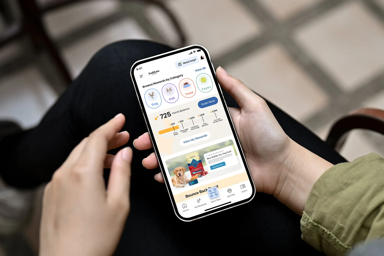
Research surfaced the friction fast. 42% of customers did not know the QR-code rewards existed, redemption was complex enough to cause abandonment, and the community features pet parents wanted were missing.
210K→810KActive users grown
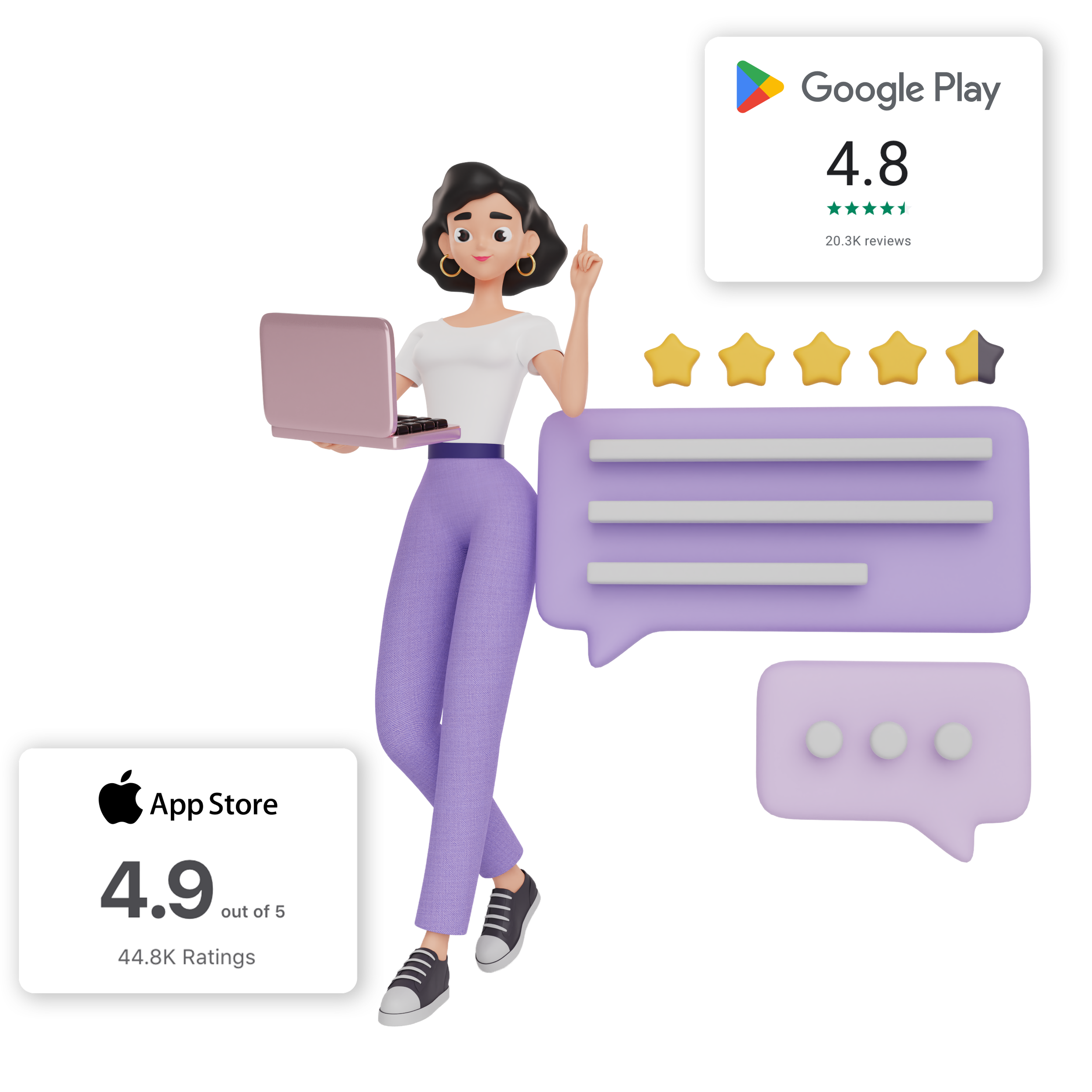
4.9 / 4.8★Highest-ever store ratings
89%Receipt-scan completion
01 · Strategy
Growth backed by evidence, not hope.
Inheriting a stable platform with 45,000 daily actives, I set an ambitious but reachable target: double the user base in twelve months through feature work and experience quality, not acquisition spend alone.
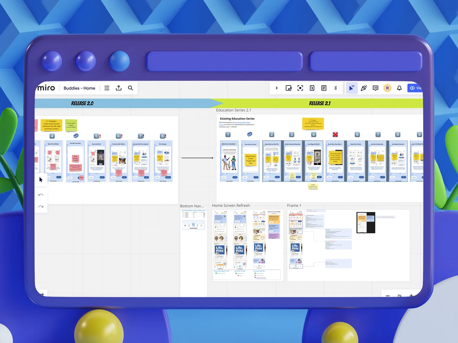
The analytics captured behavior but were not connected to design decisions. I pushed to integrate design and data, and advocated for a dedicated testing and optimization role so we could ship behind feature flags and run controlled experiments. Instead of shipping and hoping, we set up A/B testing that measured impact before full rollout. That became the basis for every major call.
I also opened a direct line to customer support, turning tickets into design intelligence. Quantitative testing plus qualitative friction gave a full picture of how a change would actually land.
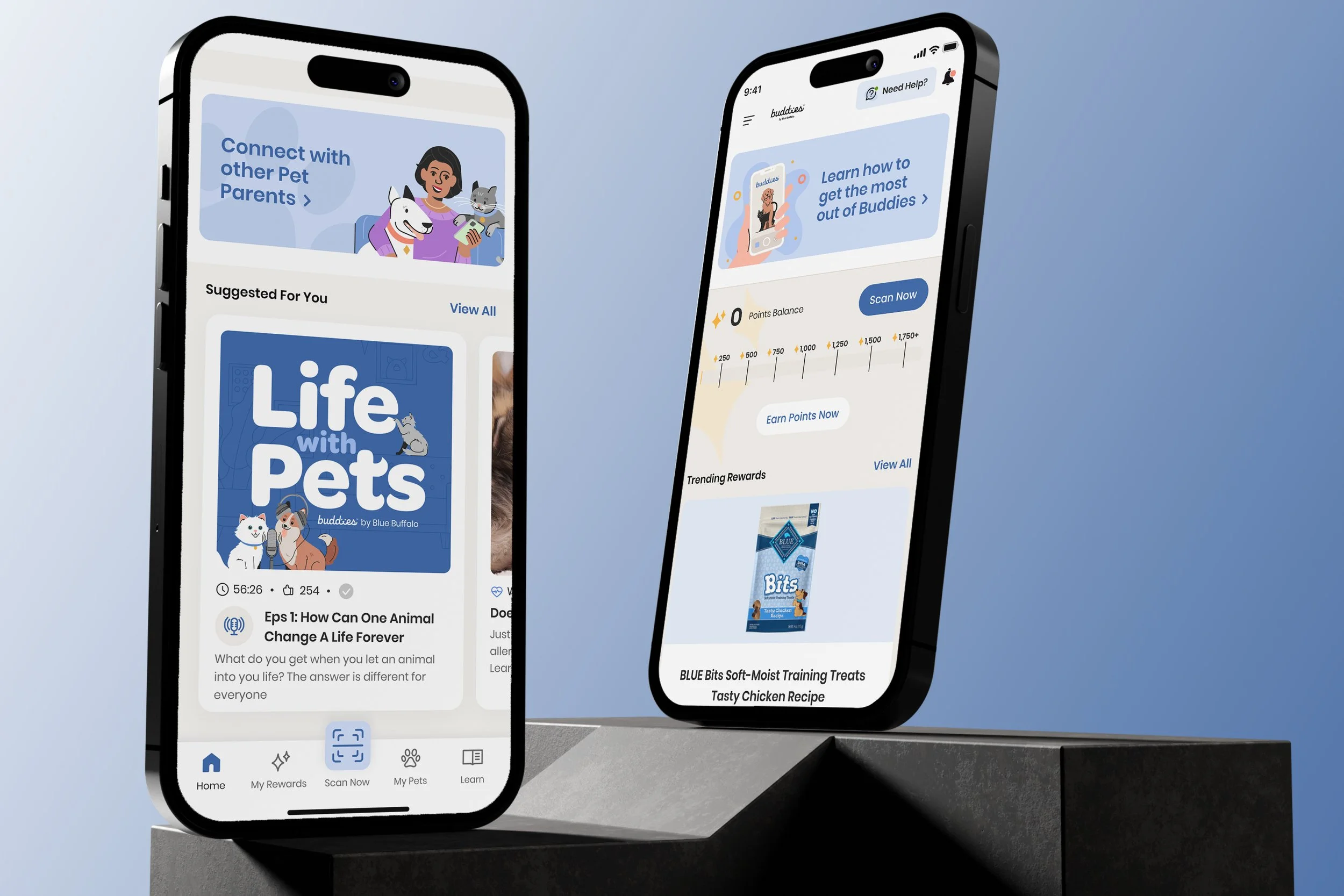
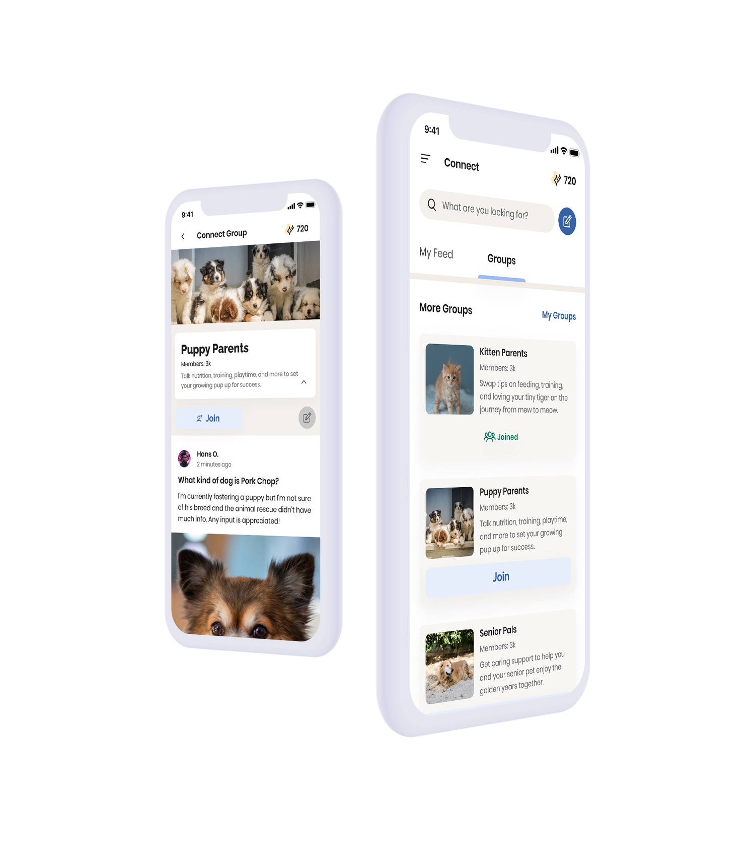
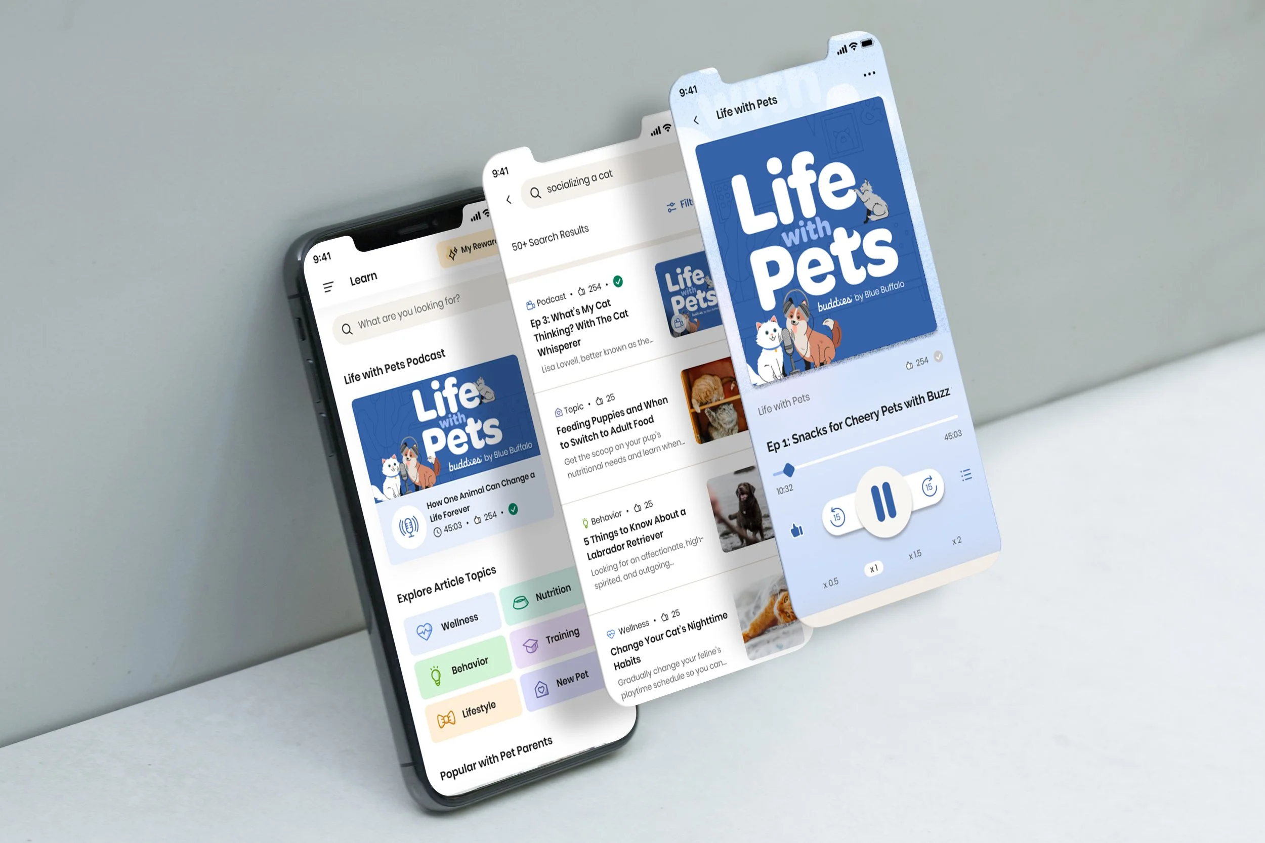
The Learn feature: educational content and pet-health articles, prioritized over social groups until core flows were solid.
02 · Test
What we tried, what we kept.
Most decisions ran through a loop of idea, test, and iterate. A few that mattered:
Focus
What we tested
What we changed
Reward discovery
Onboarding variations and tooltip placement with ~30 users
Prominent onboarding plus home-screen exposure; phased tooltips instead of front-loading steps
Redemption flow
Modal, single-screen, and step-by-step wizard with 50 users each
Wizard won at 89% completion; modal and single-screen abandoned far more
System consistency
Ad-hoc UI versus a shared component library and style guide
Built a reusable library with color, icon, and type standards and a formal review process
Engagement content
Beta of Learn and podcast-style features, plus a content survey
Prioritized educational content; delayed social groups until core flows were robust
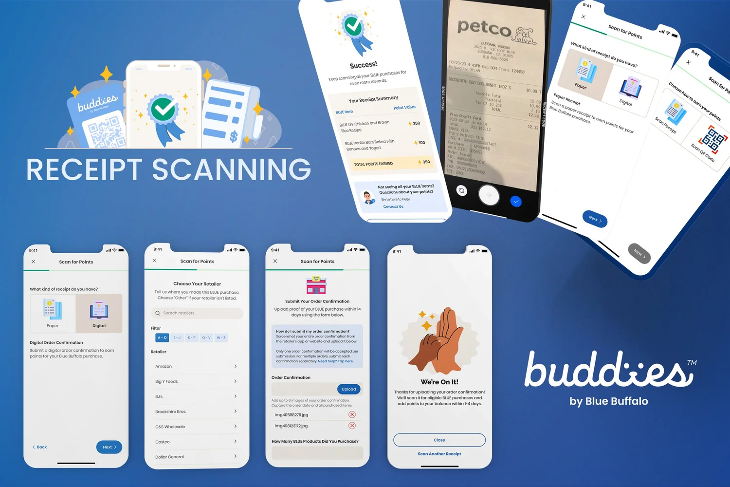
The receipt-scan flow looked simple. It took weeks of planning, three tested patterns, and a vendor integration to make it feel that way. The wizard hit 89% completion.
03 · The hard flow
Receipt scanning, end to end.
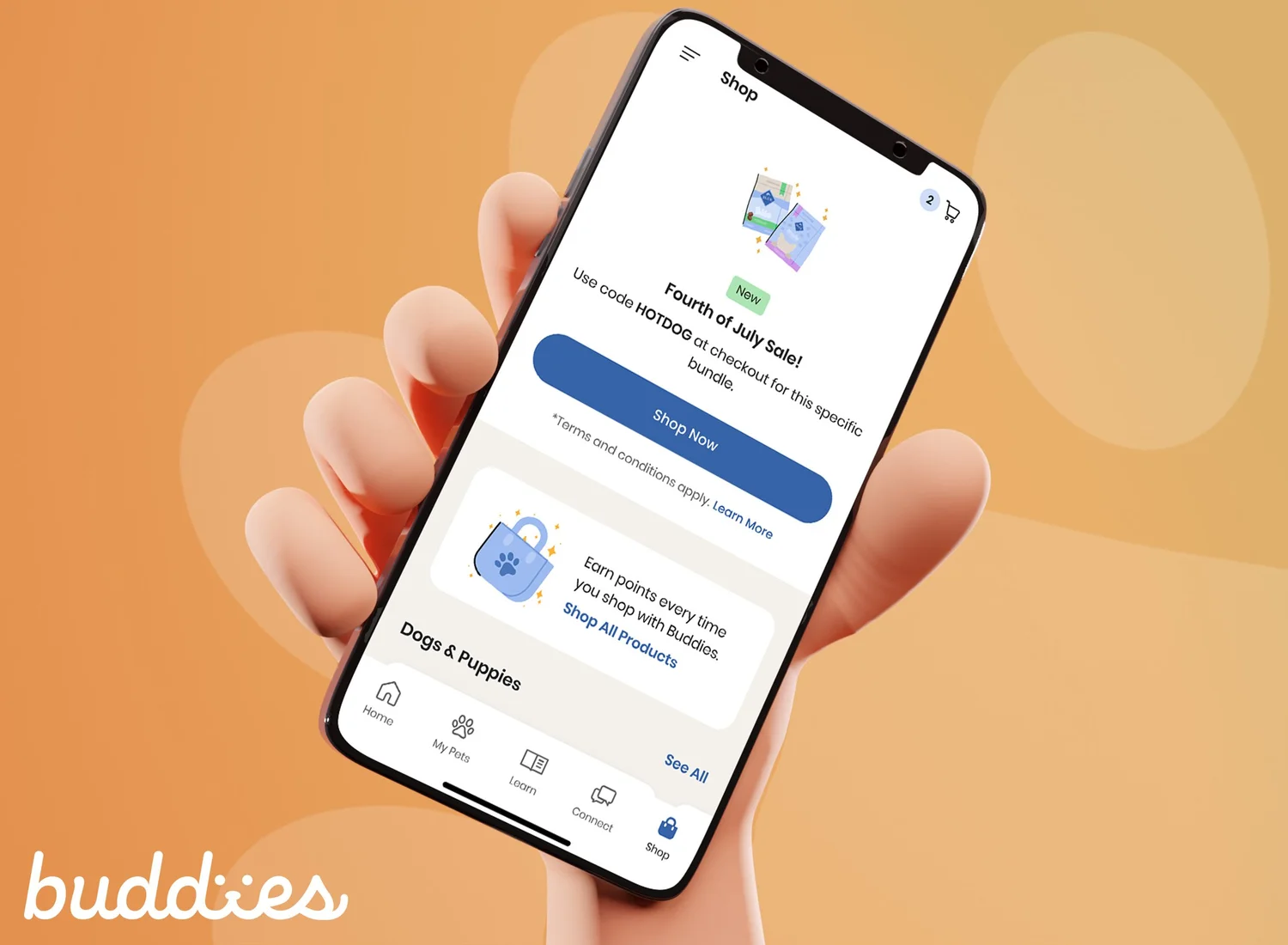
QR-code scans were costly to run, and 42% of customers never noticed the insert. So we built receipt scanning: snap a receipt, earn points, redeem for gift cards, treats, and toys. Receipts vary wildly in format and quality, so users needed contextual guidance at every step.
We partnered with Microblink to validate products, then I designed every screen from entry to success. My first instinct was not the answer: we prototyped a single screen and a modal overlay first. Single-screen had 34% abandonment, the modal confused people about progress, and the wizard reached 89% completion.
The impact was causal, not vanity. Users who completed a first receipt scan had 73% higher 30-day retention than QR-only users, and were 2.3× more likely to become monthly actives. We measured it with cohort analysis across pre- and post-launch periods, controlling for marketing spend.
The wizard: guidance, error handling, and progress at every step.Close partnership with PM and engineering from discovery to ship.
04 · Scale
A system and a team that could keep up.
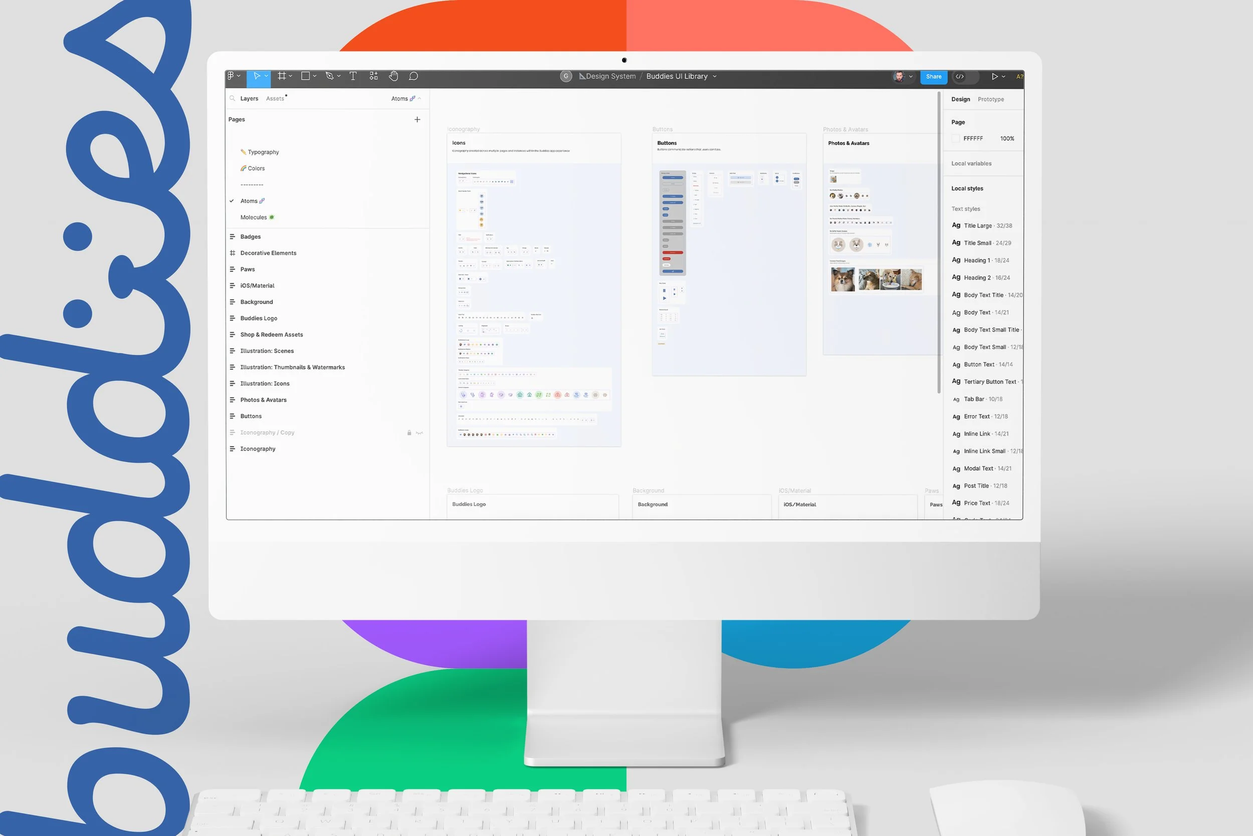
I expanded the design system into a scalable set of components, styles, and patterns covering rewards, pet profiles, health tracking, and in-app education. It improved visual coherence, streamlined developer handoff, and let the team move faster. I cataloged complaints, tech debt, and inconsistencies against journey touchpoints, then prioritized high-impact, low-effort wins first and ran a 60-40 split between fixing the foundation and shipping new value.
I led a team of four: two junior designers, a copywriter, and an illustrator and animator, plus guidance for a web designer. I set up design governance at scale: a component library, two-designer approval before production, and design-engineering pairing to catch drift before it reached users.
The component library that supported 4x user growth.
−40%Design-related support tickets, despite 4x growth
4Designers led and mentored
Results
Loved by users, recognized by the industry.
When I started in February 2022, the app sat at 4.7 in the App Store and 4.6 on Google Play. By listening to pet parents and shipping the features they asked for, it reached 4.9 and 4.8, the highest ratings the app had ever held. Active users grew from 210,000 to a peak of 810,000.
 2023 Gold Stevie Award
 Loyalty360 recognition